

Baked Coast
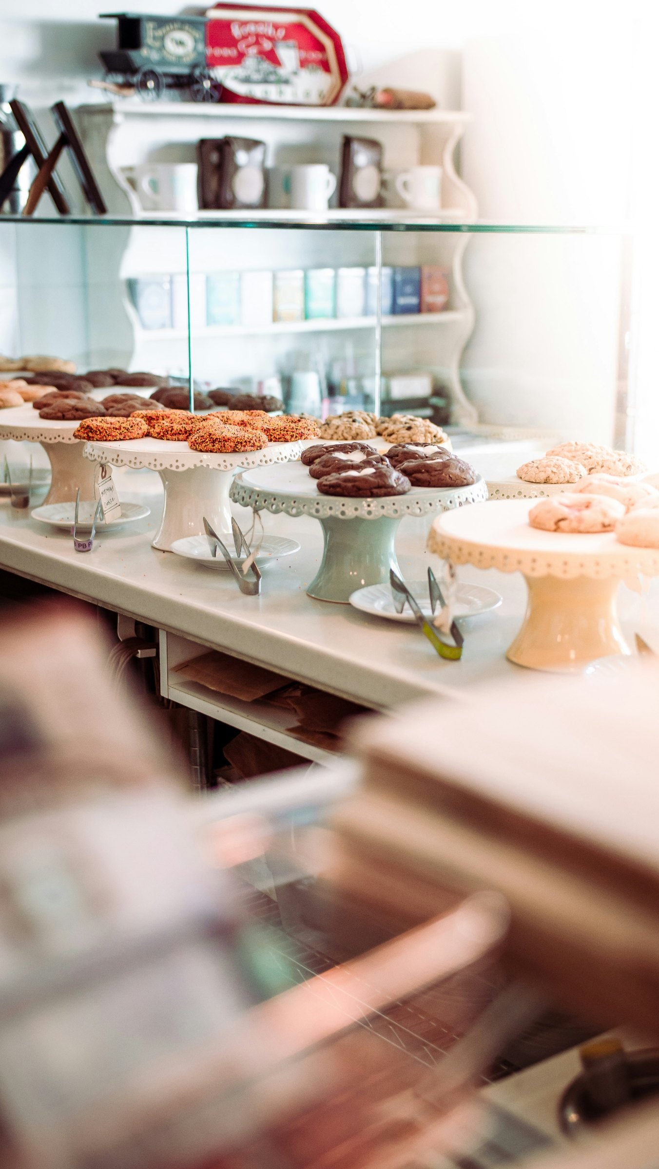
A brand platform pitch for Kings Baked, a bakery on the NSW Central Coast. Baked Coast moves the brand past the heritage bakery script and turns it into a guide to local life, because nobody knows the coast better than the people who are up before the first break.
The Challenge
Kings Baked needed to move past the stagnant heritage bakery archetype and answer what comes next. The brand had to evolve and own the coastal lifestyle space without leaning on predictable legacy tropes.
The Insight
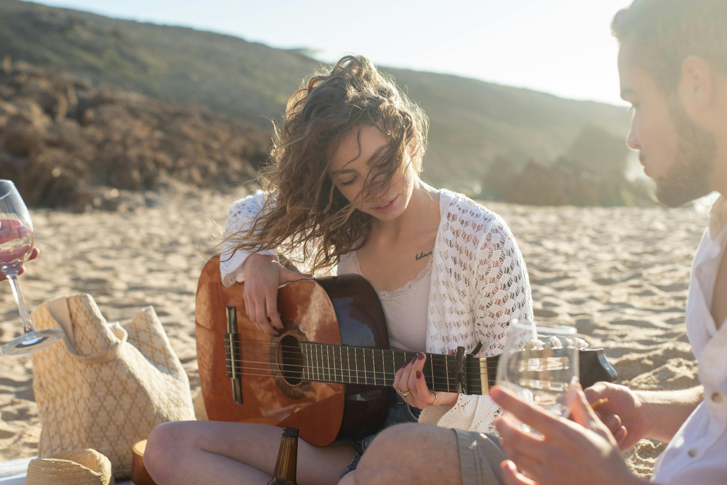
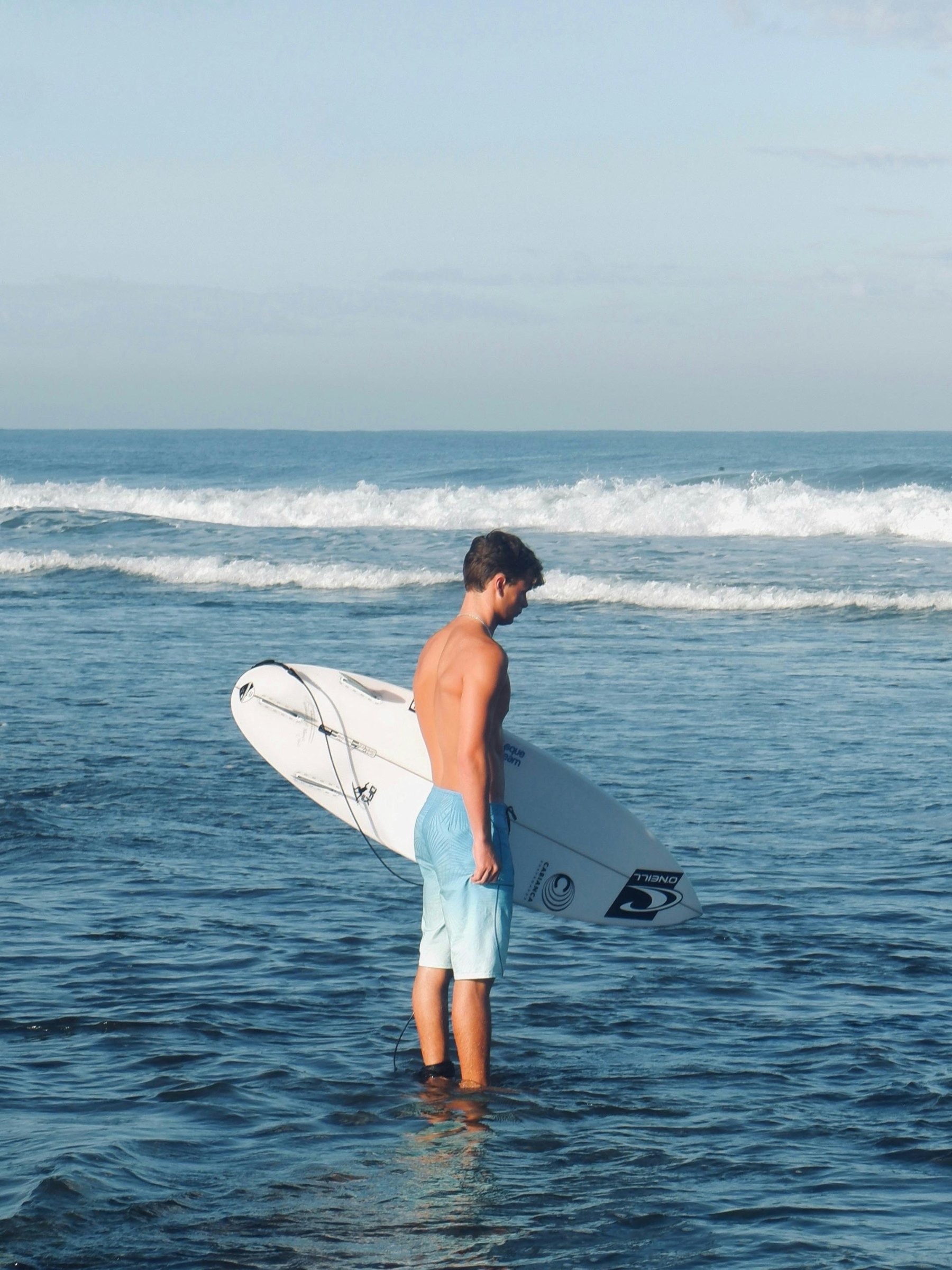
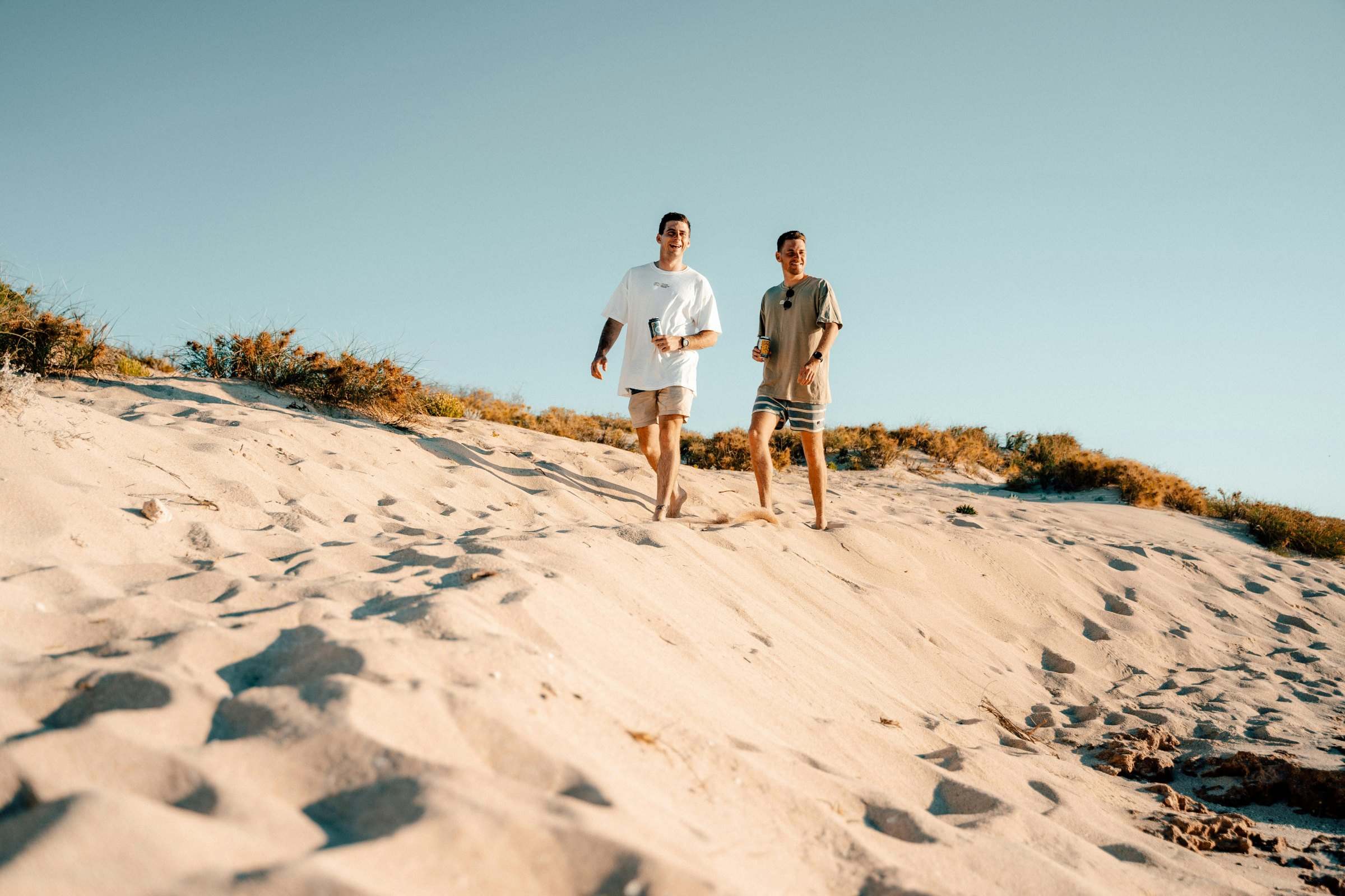
Relevance comes from acting as social curators, not just bakers. To resonate, the brand has to capture the unhurried rhythm of local life: the in-between moments that happen before work, after a swim and on the way home.
Before the town wakes,
the dough is up.
Baked on the coast. For the coast.
We are the coast.
Kings Baked
Spec brand pitch
Woy Woy
Central Coast, NSW
Brand platform, identity, packaging, social, apparel
Baked Coast
The Idea
Baked Coast turns Kings Baked from a physical bakery into a coastal lifestyle platform. A bakery opens before the town wakes and sees the coast at its best, every single day. Baked Coast puts that knowledge to work, telling locals and visitors where the swell is, which beach is quiet and where to sit with a coffee. The bakery becomes the local guide.
We arethe coast.
The platform lineBaked CoastThe Articulation
Designed to flex beyond packaging into social and apparel. By blending elegant type, raw craft and unhurried copy, the system equips the brand to curate local culture and own the in-between moments.
Elegant type
A fluid editorial serif carries the mood. It feels like the coast without drawing a wave.
Raw craft
A crown painted by hand. Every stroke keeps the marks of the person who made it, like the bread.
Unhurried copy
Short, warm lines written at walking pace. Never a sale, always an invitation.
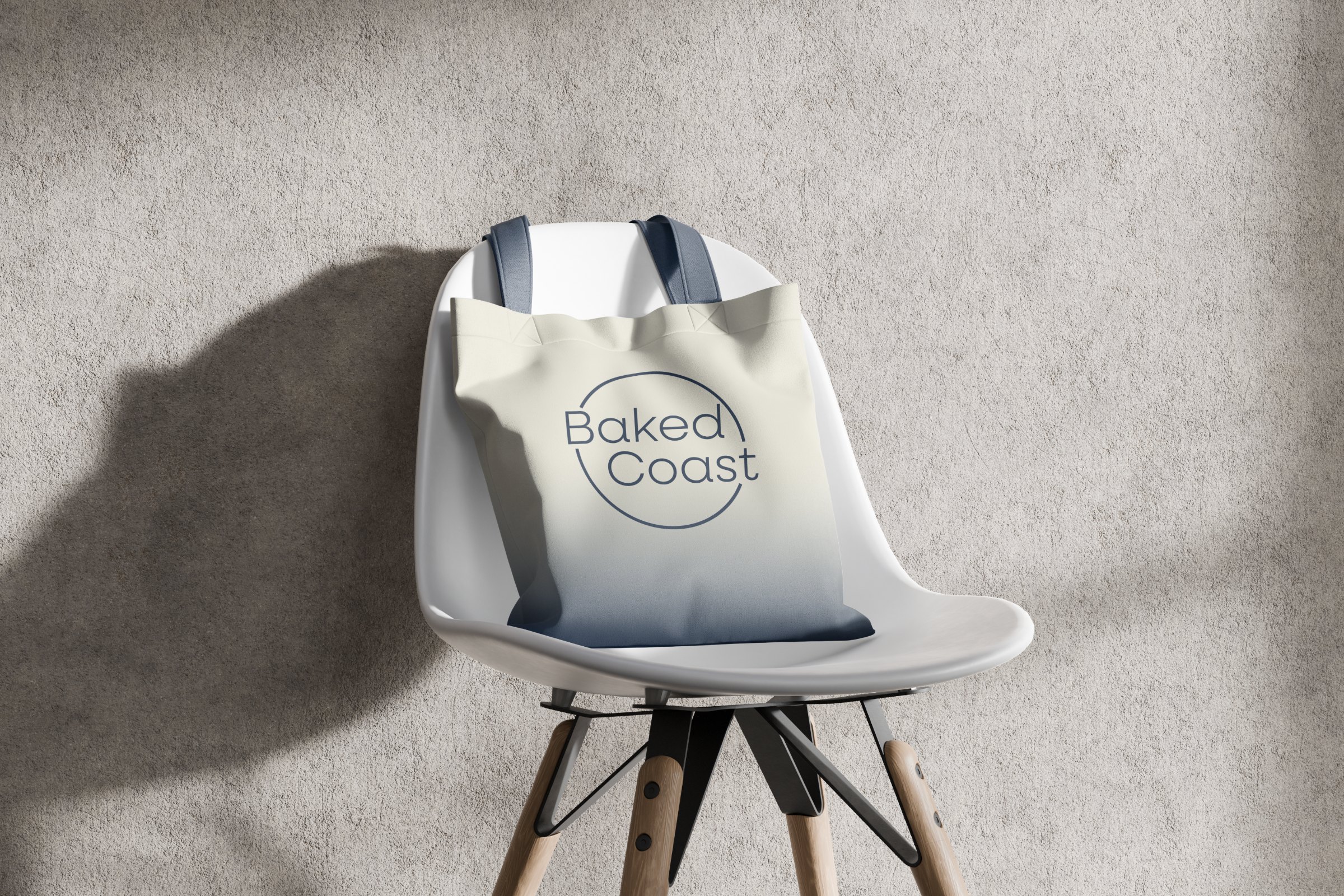
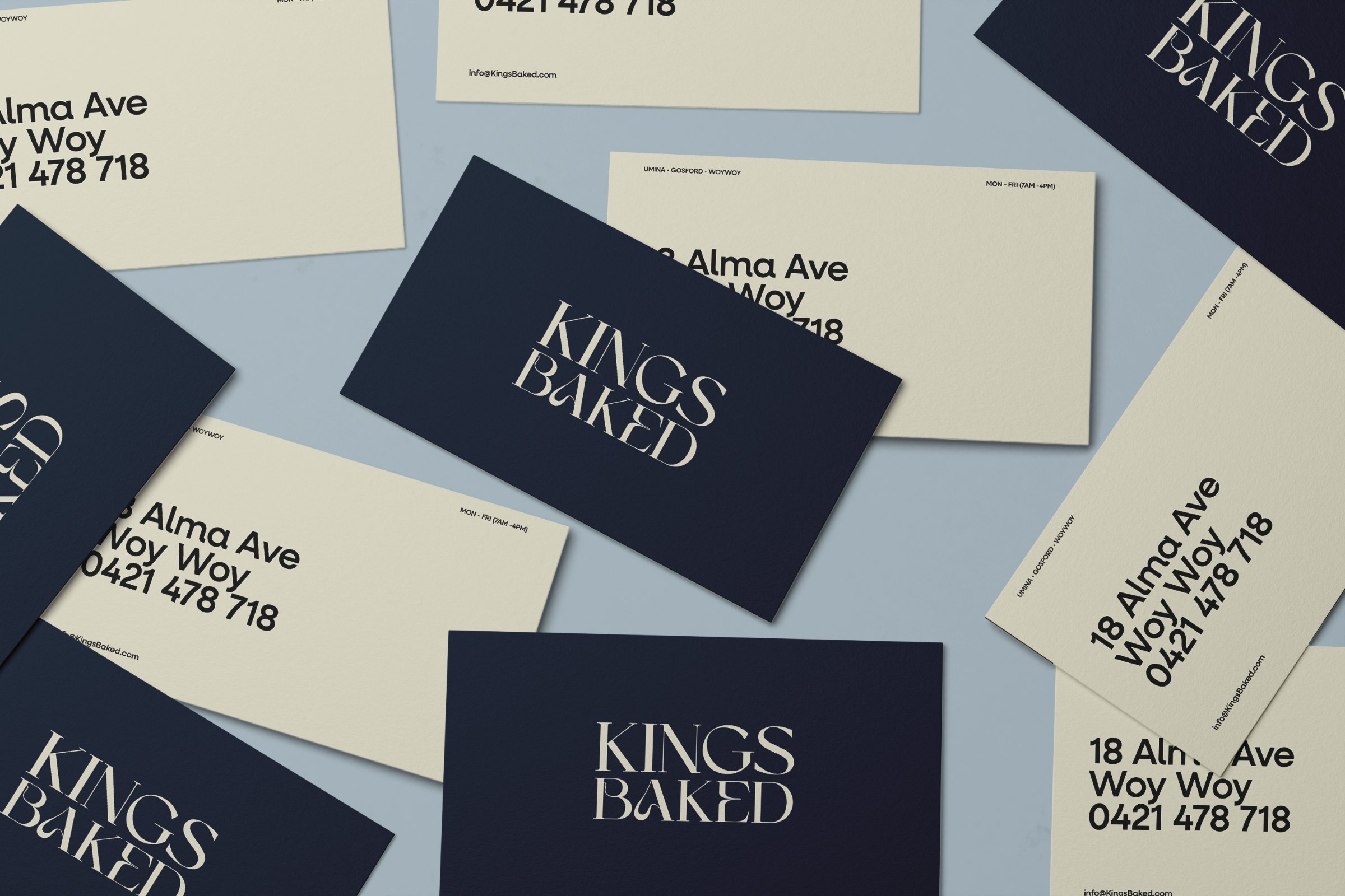
A crown painted by hand, set against a refined serif wordmark. The secondary lockup puts the crown between the words, and the Baked Coast seal carries the platform wherever the bakery shows up.
Taken from the coast at first light: the cream of the counter, wet sand, morning mist, deep tide and the navy of the water before sunrise.
Two voices. An editorial serif that sets the pace, and a quiet sans that does the work.
Ogg
This is the anchor. Its fluid, sweeping letterforms capture the natural rhythm of the coast without needing a literal wave icon to do the heavy lifting. It brings an unhurried, editorial elegance to the brand: confident, relaxed and setting the mood before you even read the word.
Neulis Neue
This is the workhorse. While Ogg sets the mood, Neulis Neue handles the everyday details. A clean, highly legible sans serif that strips away the noise and keeps the brand feeling like an accessible local staple rather than an untouchable luxury.
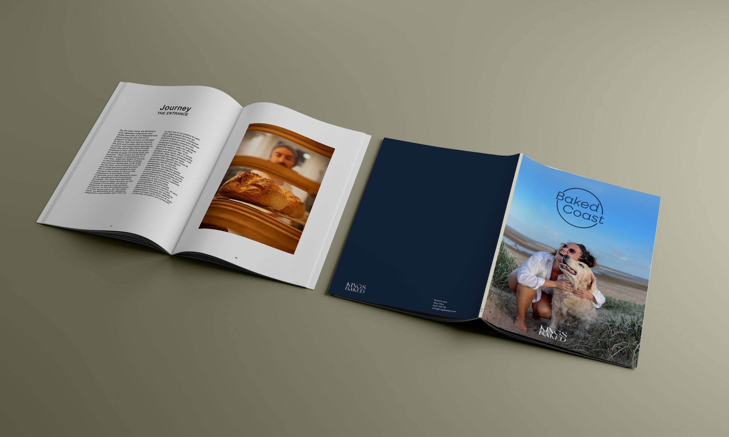
The bake stays the hero. Packaging is built to travel, from the counter to the sand, so the brand turns up wherever the day goes.
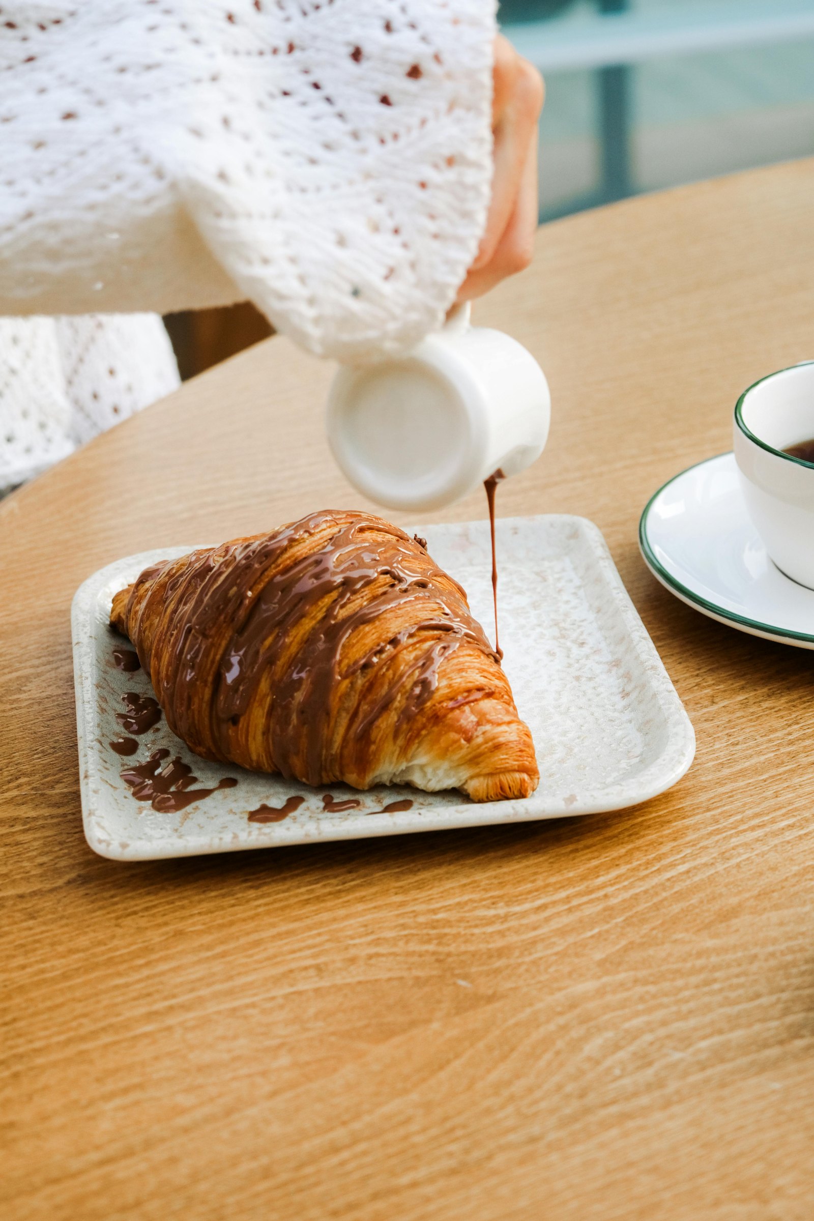
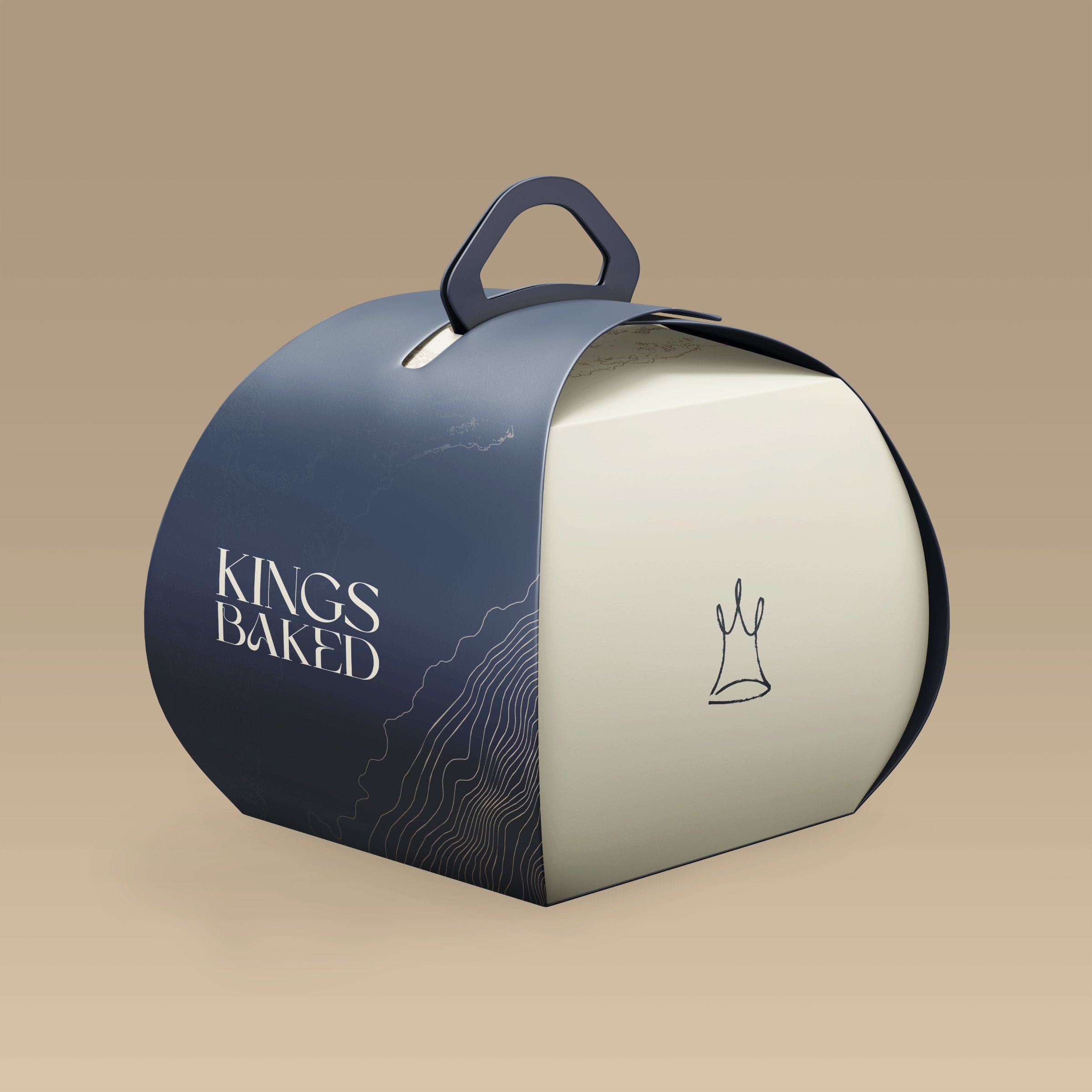
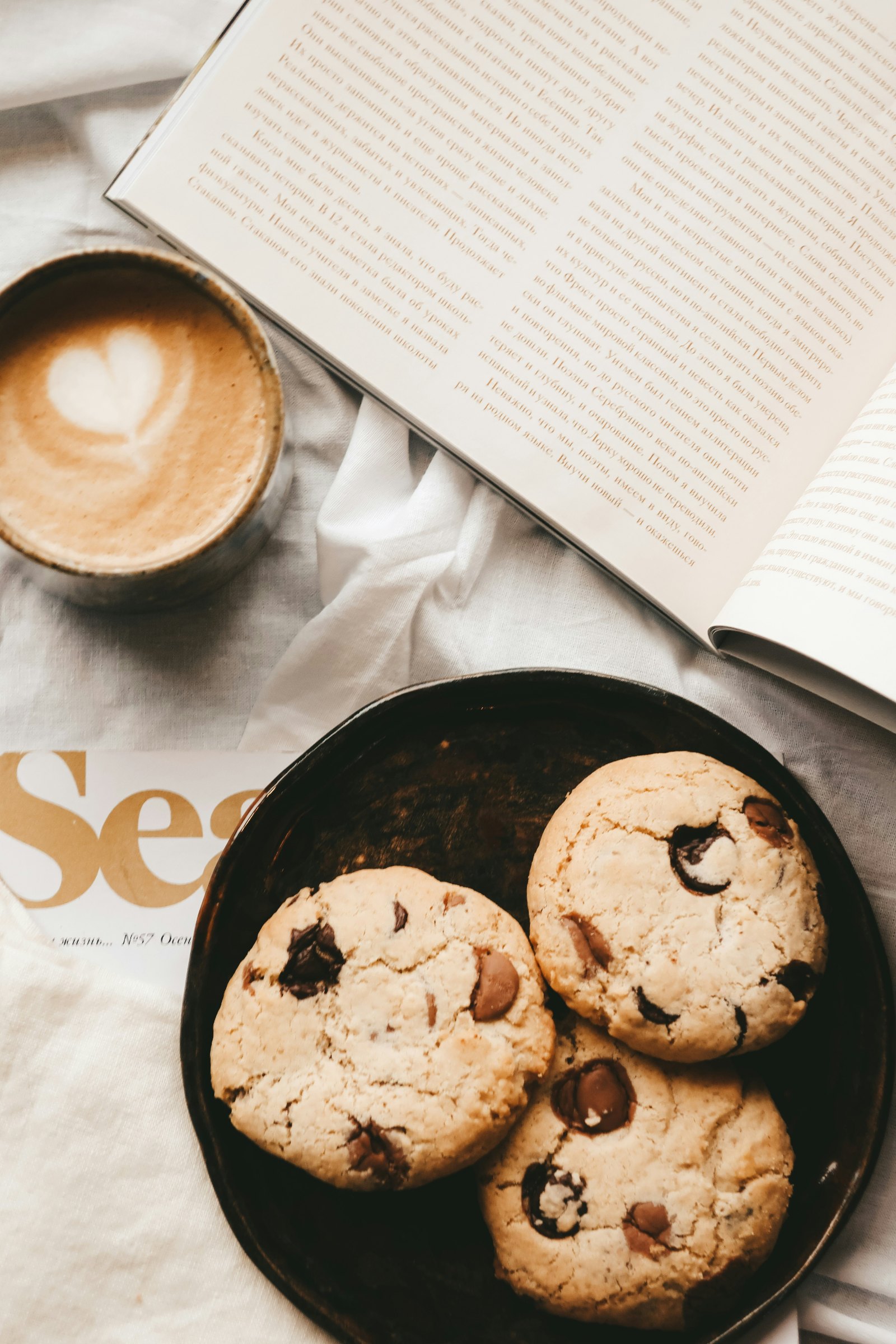
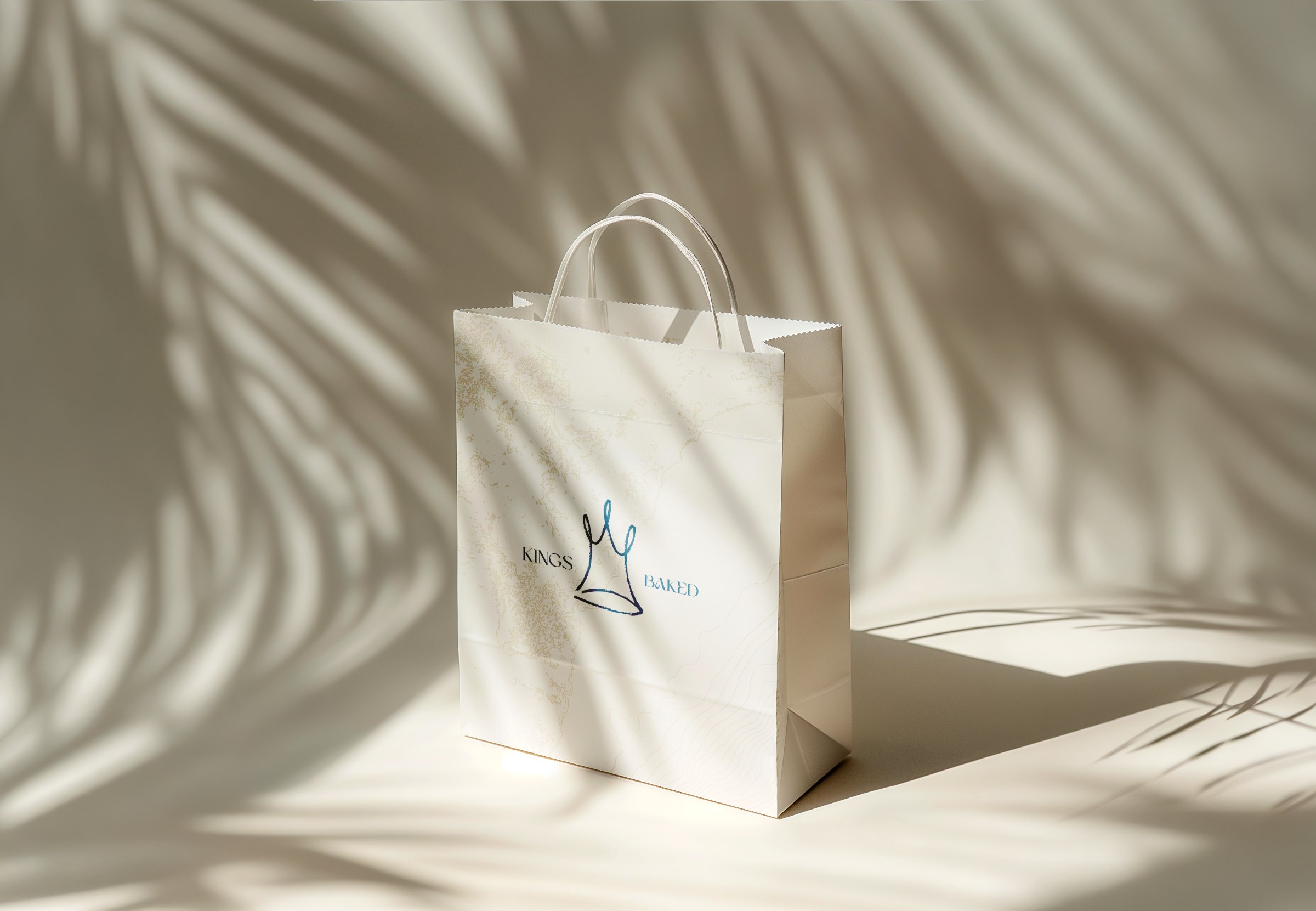
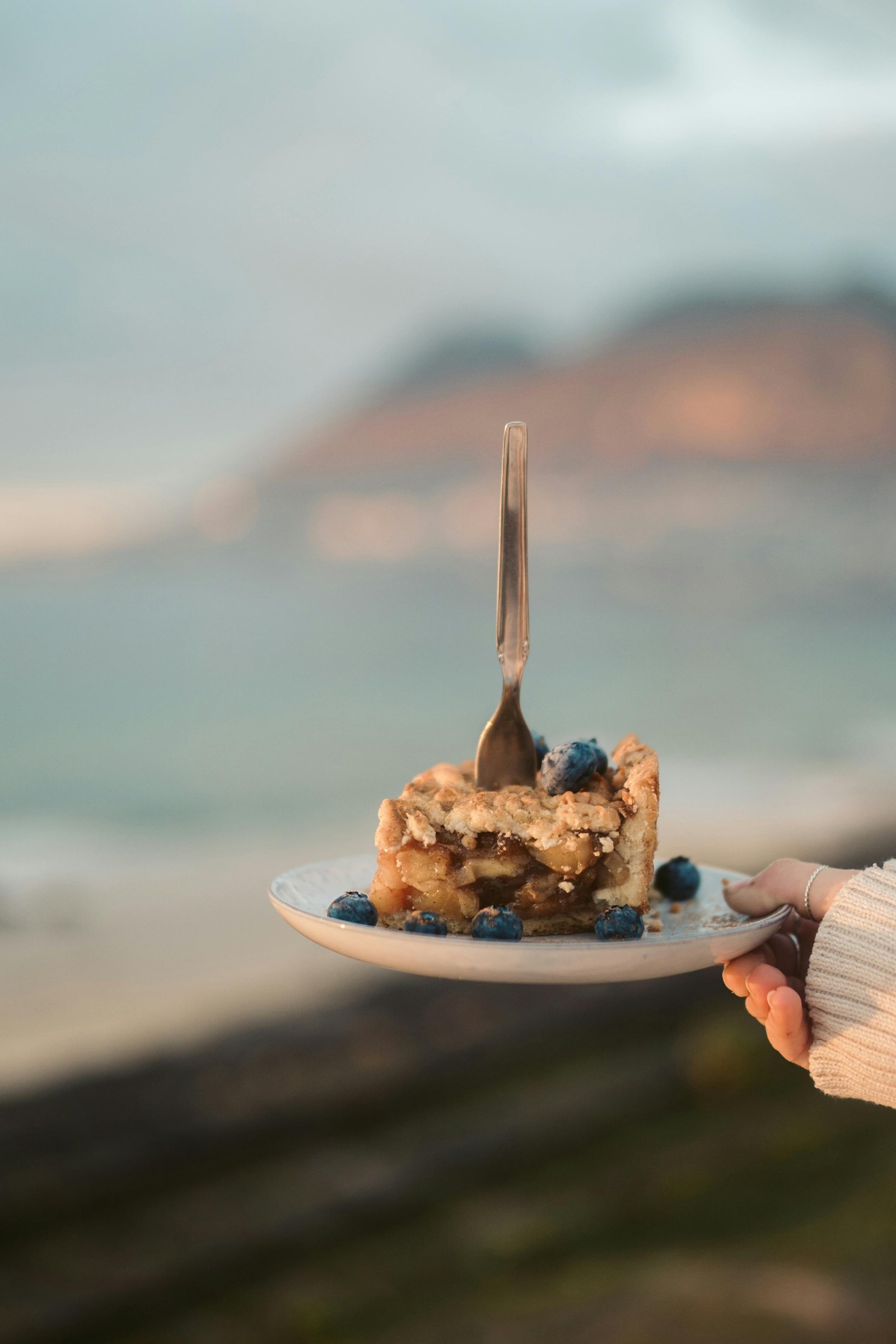
Coast Notes is the platform at work. Field notes from the people who are up first: where to swim, where to walk and where to sit still. Shared on the box, in store and on social.
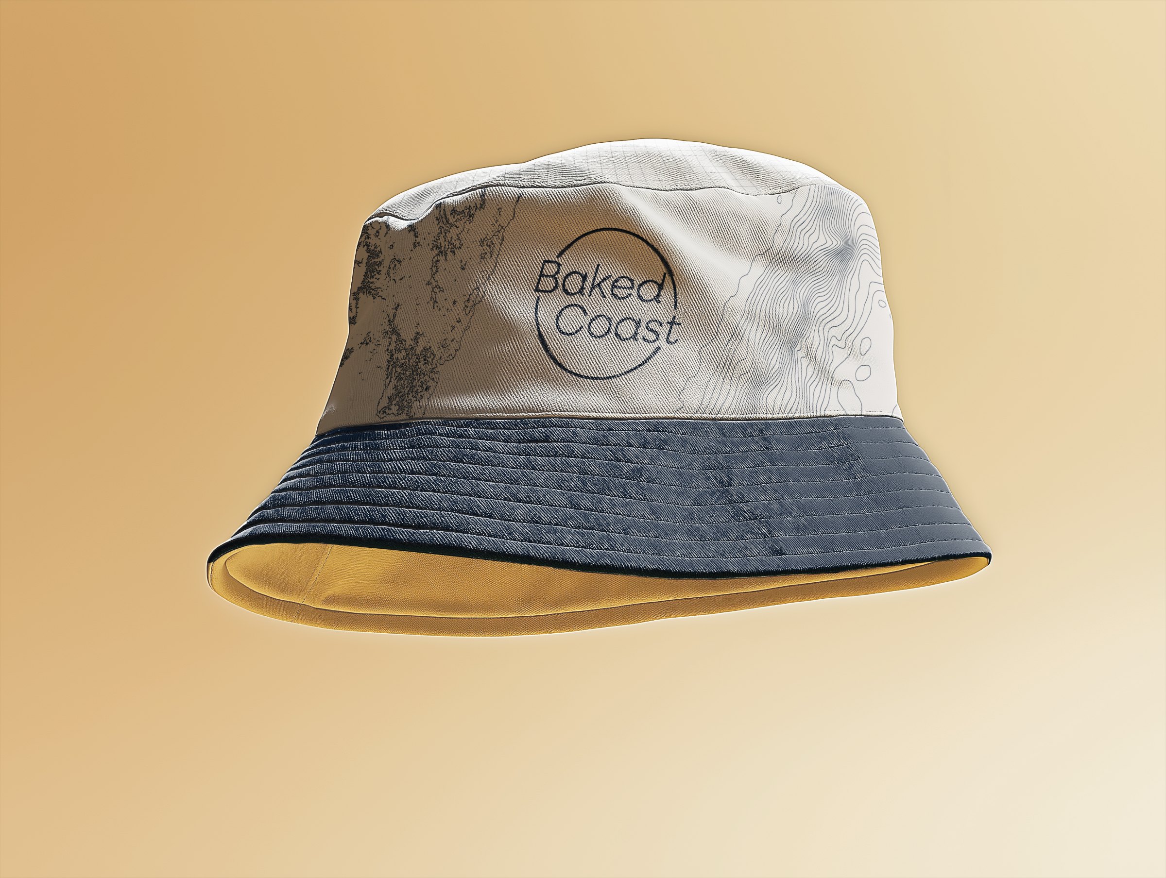
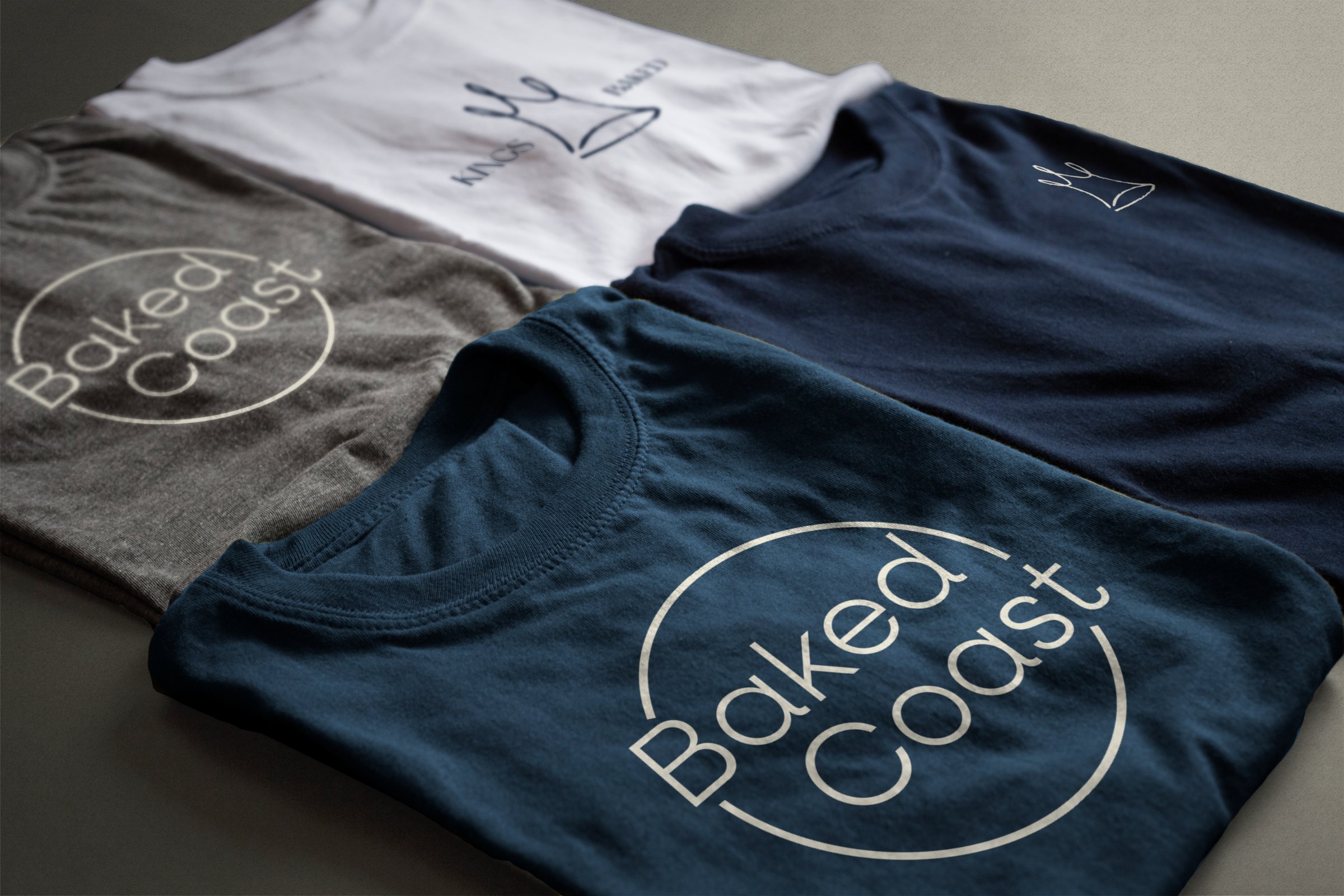
Apparel, print and merch that locals actually want to wear. The seal travels further than the shopfront ever could.


Kings Baked: Baked Coast is a speculative brand pitch and has not run in market.Stock footage via Pexels. Product and apparel shown as mockups.